
TOP UP TERMINAL
The current top up terminal for Dutch Transport Cards - the OV Chipkaart - is being replaced and required a new design to bring the terminal to a more modern and easier feel.
current system
REDESIGNING THE TOP UP TERMINAL
From interacting with the current version of the terminal there were a lot of usability issues that were apparent. Some were due to physical limitations and some due to certain interactions being linear with no choice to retrace steps.
Meeting with the client, the use cases were explored in a workshop to see what the new device (which features a full colour and larger screen) could accommodate.
The client initially expressed that design should follow the aesthetic and flows used in the current terminal.
Meeting with the client, the use cases were explored in a workshop to see what the new device (which features a full colour and larger screen) could accommodate.
The client initially expressed that design should follow the aesthetic and flows used in the current terminal.
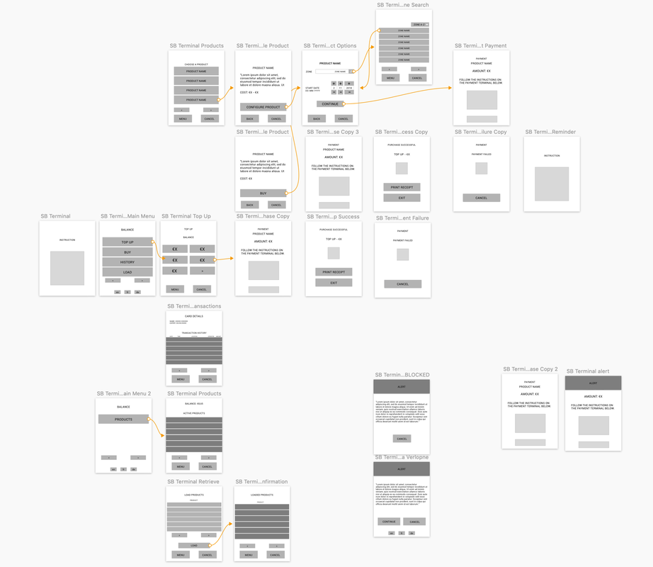
INITIAL WIREFRAMES OF SYSTEM
NOTES FROM FIRST WORKSHOP WITH REDESIGN TO ACCOMMODATE REQUESTS OF CLIENT
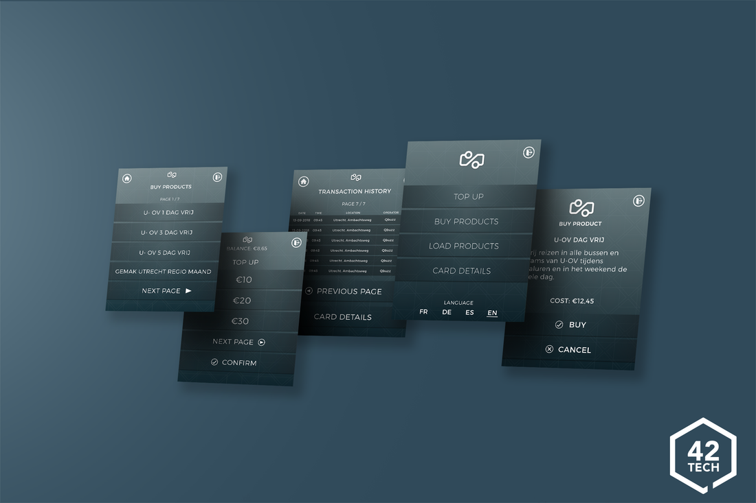
INITIAL MOCKUP
Here are the first set of high-fidelity screen designs that were accepted by the client per their requirements and notes from the workshop.
Although received well, stakeholders wished for a more modern feel for the terminal. And so the task began to redesign the terminal to have a better feel and use.
Although received well, stakeholders wished for a more modern feel for the terminal. And so the task began to redesign the terminal to have a better feel and use.
Current version
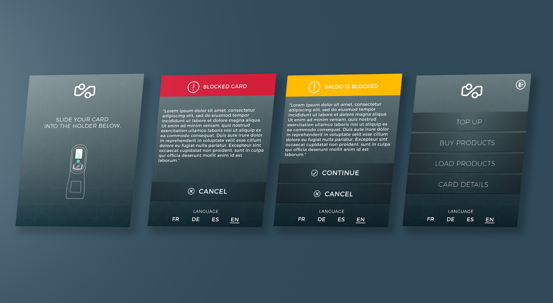
FIRST INTERACTIONS
An animation plays to instruct the user how to place their card into the holder. Also shown are the possible in between states between card read and main menu.
Fatal and non-fatal errors can occur, fatal errors prevent any interaction where as non-fatal errors reduce functionality available at the top-up terminal.
The main menu is divided into the following sections:
Fatal and non-fatal errors can occur, fatal errors prevent any interaction where as non-fatal errors reduce functionality available at the top-up terminal.
The main menu is divided into the following sections:
- Top Up
- Buy Products
- Load Products
- Card Details
- Language Select
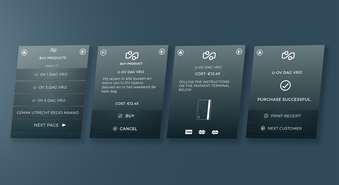
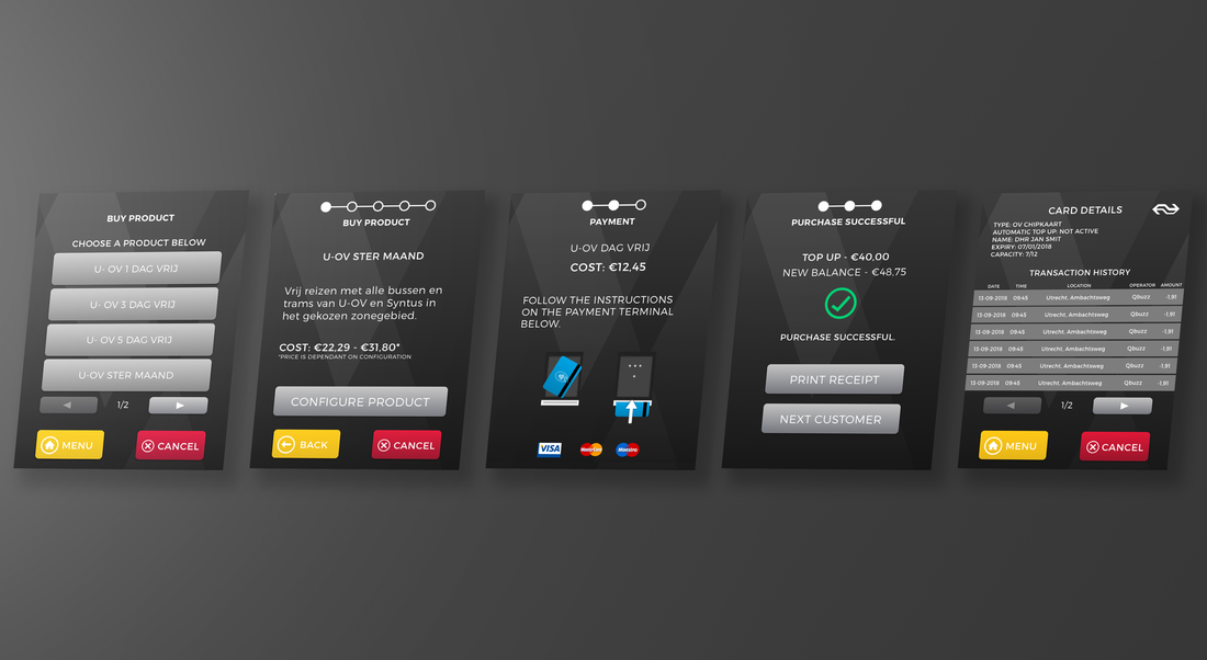
SIMPLE PRODUCT PURCHASE FLOW
At the new top up terminal, the ability to buy products is available. The simple product is non-configurable, and upon confirmation, proceeds straight to purchase.
Currently the Top Up Terminal locks a user into the payment screen upon interaction, and to cancel, the user must remove their card and start the entire interaction again. The step of a buy button to confirm the action allows the user to change their mind without this frustration.
A monochromatic colour scheme is used to in conjunction with icons for international users and those with accessibility needs.
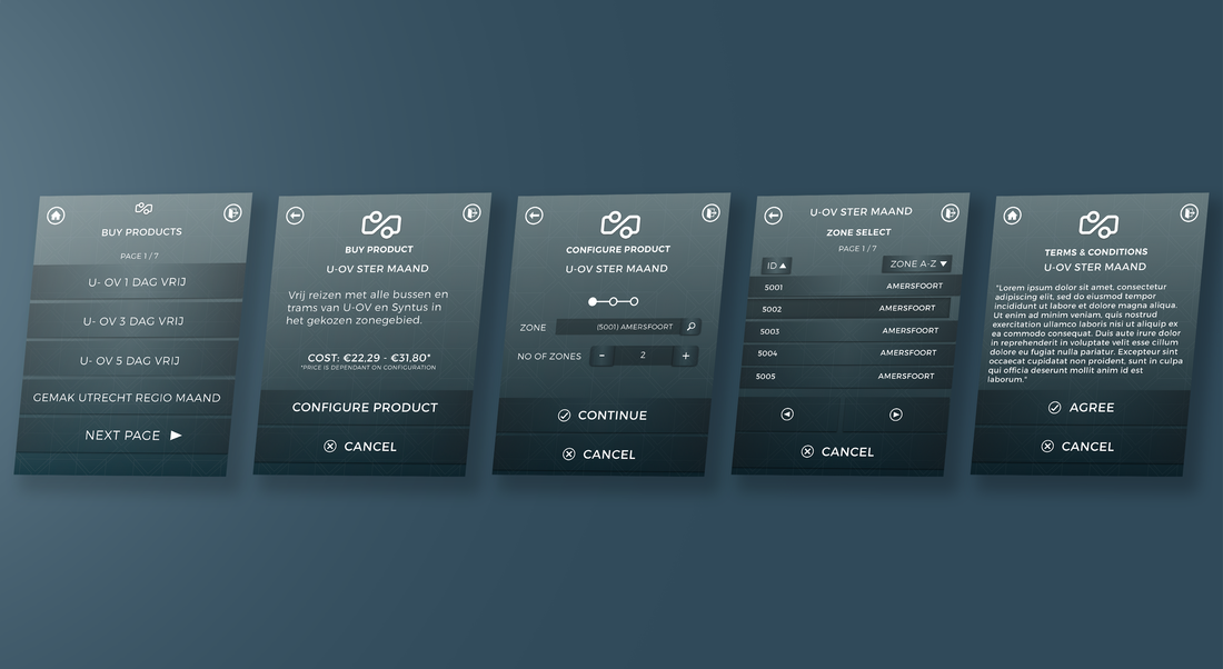
CONFIGURABLE PRODUCT FLOW
Configurable products have multiple stages that affect the price.
These screens are usually related to region / time and are loaded onto the cards for use. On these screens the number of steps of a purchase is shown. Certain functionality, like lookups, are brought onto new windows for ease of use.
Also shown is the terms & condition page as certain products have recurring payments that the user must agree to first. Once agreed to, the payment screen is shown like the simple product.
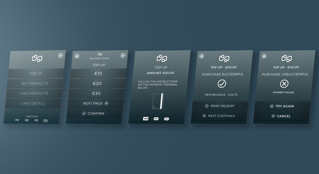
TOP UP FLOW
The primary function of the Top Up terminal is to top up the balance of the OVChipkaart.
Currently, a selection of amount will lock the user into the payment screen, here a confirmation is introduced to prevent the user from getting into flows they did not intend of.
An example of the fail states that can occur at payment is shown, with the option to retry the payment. At present, if a failed transaction occurs, the user must remove their card and start the process of topping up again. Verbose error messages are shown to indicate the problem for the user.
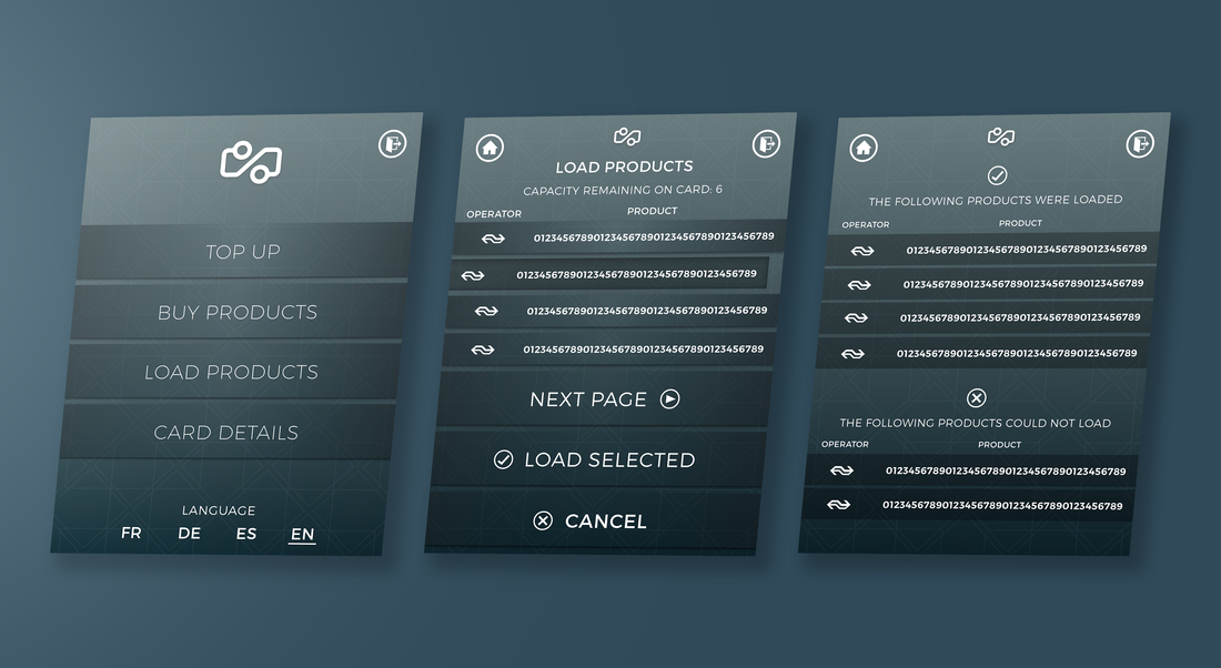
LOAD PRODUCTS FLOW
When a user purchases accounts / have discounts they must be loaded onto their card to be active. This is common functionality at ticket machines but bringing this to the top up terminal allows users the ease of doing this at their supermarket instead of having to travel to a station.
Here all active products are shown alongside the provider. The user can select multiple products (providing the capacity on the card allows) to load.
Confirming this action will show whether products have been loaded or not.
Here all active products are shown alongside the provider. The user can select multiple products (providing the capacity on the card allows) to load.
Confirming this action will show whether products have been loaded or not.
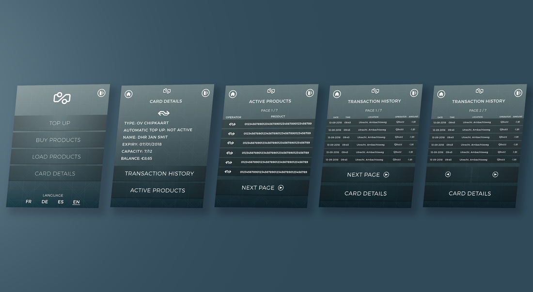
CARD DETAILS FLOW
Here we can see the extended functionality of seeing the details of the card.
On ticket machines this is easy to see as there is a lot of screen space, bringing this to a smaller touchscreen means that it must be reworked to fit the functionality.
Card details are the first items to be seen with options to view active products and transaction history of the card. Although the notion of security does come up, unfortunately the OVChipkaart does not have a security measure to prevent reading details at any machine.